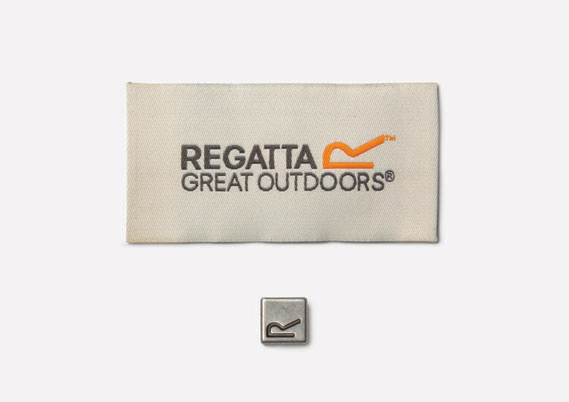
It's an R, it's a hill of some sort. It's a new logo for Regatta. It's not overly ambitious or aspirational, although some of the photography helps along those lines, and the "ATTA" is nicely spaced.
It's tightened the whole identity up, which is a good thing, and the zip toggle looks nice.
London design studio SEA has created a new logo, visual identity system and seasonal ad campaigns for outdoor clothing company Regatta.
A family business founded in 1981, Regatta is one of the UK's best selling outdoor brands but as it isn't particularly 'consumer facing' – most products are sold online and through third party retailers – it had never developed a strong, coherent identity, says SEA founder Bryan Edmondson.
Read the original article on CR Blog »


